
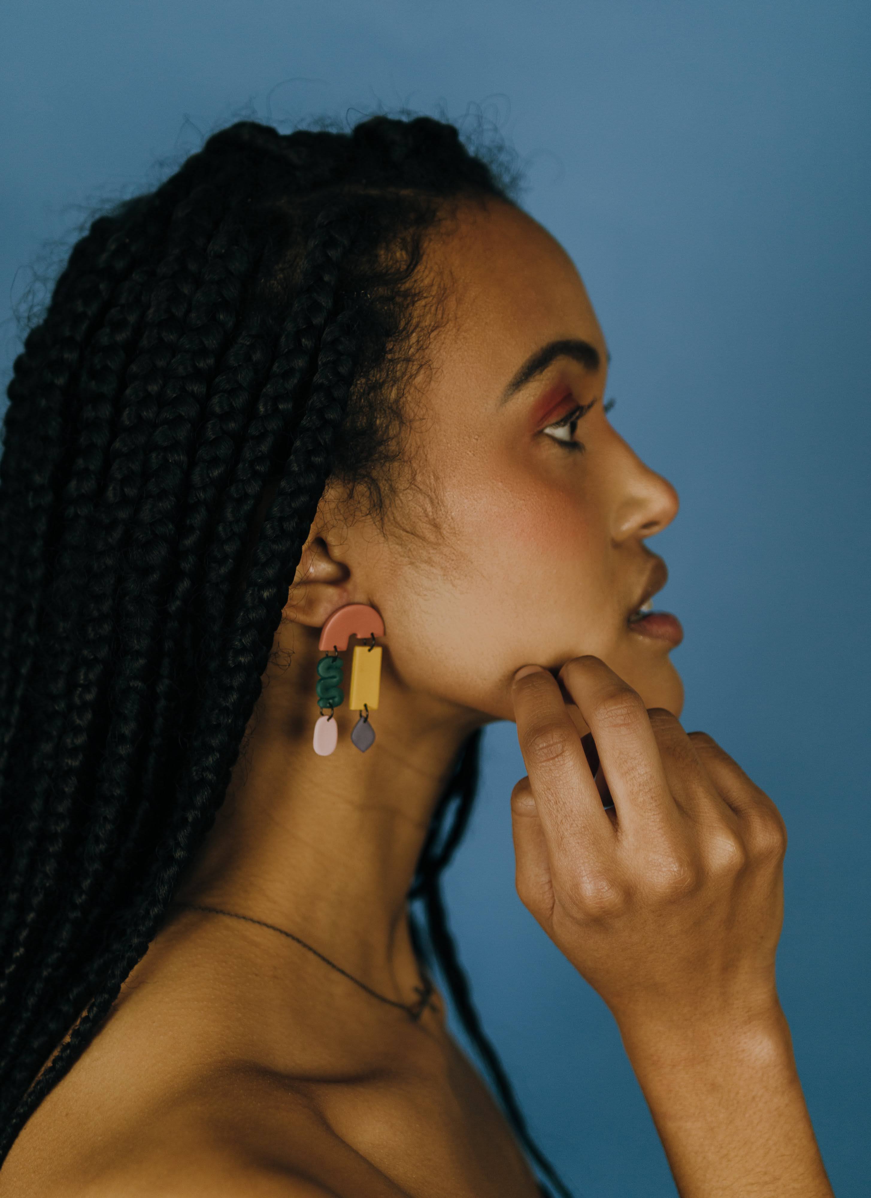
Feminiscence Co. is a local Utah jewelry company founded in 2019 by Tayla Chapa with a mission to support and inspire women. Every unique, handmade collection at Feminiscence is carefully designed and crafted by Tayla and named to honor historical women. With her company, Tayla fights the underrepresentation of women and hopes to empower others to carry on their legacy.
- branding
- identity design
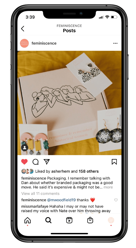
- packaging
- social consultation
I worked with Feminiscence Co. to create a unique brand identity that embodied their mission and could encapsulate their vision for brand success. In less than a year, Feminiscence grew to a community of 144.9K on Tiktok. The brand message overall: to support and uplift women everywhere, to create a safe place to land for all people. With Tayla as the spokeswoman for her brand, she was able to tell her story through social media. The result: 12.5M views on her most engaged with Tiktok and an average of 147K views per TikTok overall.

I created a visual brand identity for Feminisence including logo, custom fonts, color palette and custom illustrations for packaging. The brand is whimsical and modern so I wanted the colors and logo style to match while incorporating importance of women supporting women theme. That is how the Lean logo was born. It is meant to represent how all women lean on each other and support one another.


Packaging and stickers

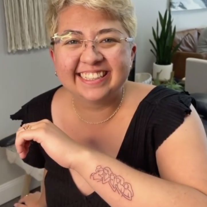
Fully embodying her brand on the year anniversary of her launch, Tayla got a tattoo of the icon illustration I created for her. It was such an honor as a designer to create something so meaningful for a client.

feminiscenceco.co
photo source: @capturedbyabbey | capturedbyabbey.com
